
10 Examples of Brands With a Bold and Beautiful Visual Identity
- Hyper Studio
- Nov 1, 2022
- 8 min read

So this is the list of the 10 best branding and corporate identity design examples. Now, let’s get one thing out of the way, this isn’t really the best. (I mean, who am I to judge that? Is anyone really qualified to make that list? But I digress; I had to include “best” because our content manager said it would be good for SEO.) So, if you searched for “best” and ended up here, well, you’re welcome. So, while this is not the authoritative list, it is a list of some very solid branding and identity designs that have turned up over the last few years.
And if you like what you read, go ahead and subscribe to Lucidpress — right here on Medium.
Airbnb

A few years ago Airbnb decided that their brand needed a refresh, so they called in San Francisco-based DesignStudio for some help. When Airbnb rebranded, it was very controversial both inside and outside of the design world. But as with many logo and branding redesigns, after some time has passed, it’s easy to look back and see that they made the right decisions. It’s obvious now that it was the right decision to move away from the then-trendy script logotype to the more iconic stylized “A.”
DesignStudio worked hard to incorporate the international, friendly, adventurous and belonging nature of Airbnb. This meant simplifying the logo from words to just an icon, eliminating language barriers and making it universally recognizable. By incorporating a large palette of colors and a variety of photography styles, any culture or country can now identify with the Airbnb brand.


Key takeaways
In this case, the old branding for Airbnb did not align to the values and needs of the company. It called for not just a revision or an update, but a complete overhaul. I respect them for being willing to undertake a massive change to their branding for the greater good of serving their customers.
Spotify
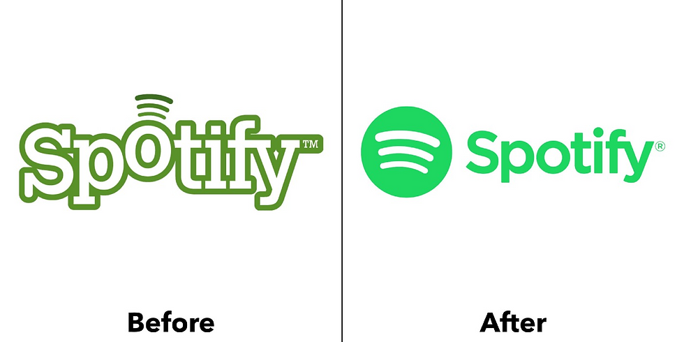
Spotify, the Swedish music streaming service, has taken music lovers by storm. But the original branding is probably foreign to most American listeners. It was a funky logo type with the “O” lifted up and (what I assume are) radio waves coming out of it.
In 2013 Spotify updated their design, focusing on the “circle with radio waves” motif. They stuck with the green and white but introduced a gradient that gave the mark some fake 3-D dimension. In 2015 the brand consultancy group Collins took a crack at refining the 2013 logo design. And in my opinion, they knocked it out of the park. One of the things I love about the Spotify branding is that it successfully uses a large color palette. While green is their primary color, it is certainly not the only color they use. I also appreciate the use of the duotone technique, gradients and pop art graphics. These techniques can help pull the branding together even though Spotify features musicians who represent a large spectrum of styles.


Key takeaways
Don’t be afraid of color. Consider using unexpected art styles, like duotone, as key parts of the visual branding.
Australian Open

The Australian Open went through a rebrand in 2016 by agency Landor Australia. They took a dated logo and completely overhauled the look. They eliminated any visual reference to tennis players or tennis balls and simplified the mark down to just “AO.” They simplified that even more by knocking the crossbar out of the A. They then applied this “circle and delta shapes” motif across all other branding. The result is a branding system that is bold, athletic and fun. They eliminated all of the stuffiness that the previous logo had.
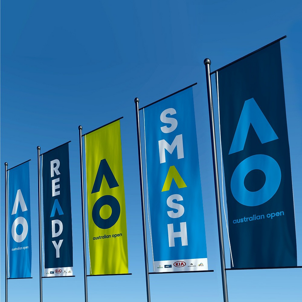

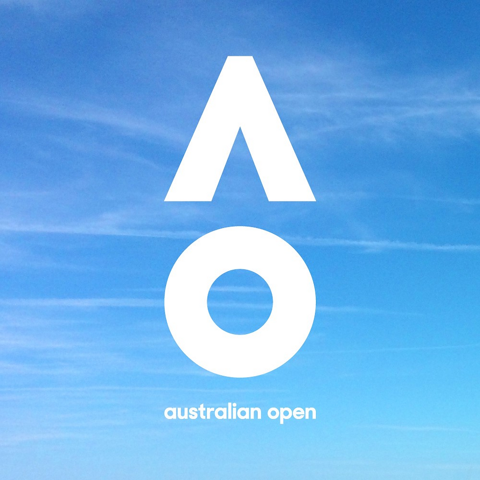
Key takeaways
Sometimes a logo needs to be completely rethought. If the current logo is not true to the goals and values of the client, it’s got to change. Also, don’t be afraid to boil a brand system down to simple, essential elements.
City of Melbourne
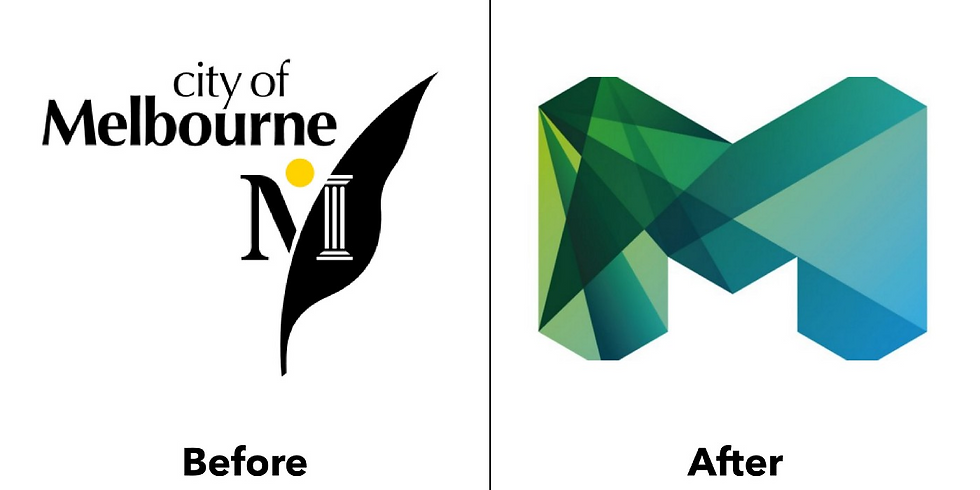
A great follow-up to the Australian Open is the rebranding of the City of Melbourne back in 2009. Melbourne had a very safe, predictable city logo. It had all of the required “city logo things”: Sun? Check. Roman column? Check. Some sort of plant? Check. It was very official-looking — and very boring. The city also had a problem in that every city department and event had its own logo, without any consistency.
In 2009 the city rebranded, completely overhauling the logo of the city and introducing a identity system. I just want to note that this is a difficult task for any large organization, but government organizations are notorious for being resistant to change, so kudos to the designers and their government counterparts for pulling off this redesign.
The new design is simply fantastic. It does so many positive things for the branding of the city. First, it better reflects Melbourne’s vibrant culture and makes it more appealing to visitors. Second, it unifies the many different logos that existed before. Finally, it creates a visual language that can be used across all of their messaging. I appreciate the nice details, like how the logo can be broken up into individual shape elements, making it even more versatile.


Key takeaways
Just because logos for a certain type of client are usually boring doesn’t mean the one you make has to be. Cities are not known for having great logos, but Melbourne bucked that trend. Make the logo and identity system versatile enough that they can be used in a variety of situations and needs, so the design system is future-proof.
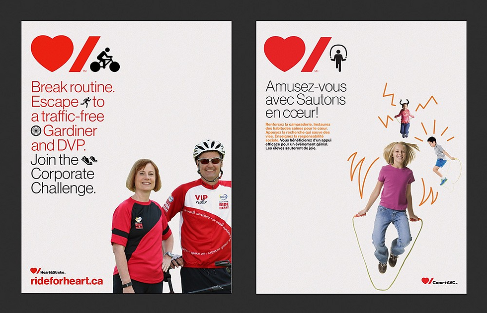
Heart & Stroke Foundation

The new Heart & Stroke logo is a master class in minimalism and reduction. Pentagram’s famous Paula Scher took a busy, very official-looking logo and distilled it down to its basic message. I really appreciate how Scher tucked everything so close together. The stroke mark is neatly placed under the curve of the heart, and the closely tracked typography is snuggled in tight under the stroke. The Heart & Stroke mark is strong enough that the name can be eliminated and replaced with locations, departments, etc., making the mark multi-functional.
Key takeaways
The beautiful thing about this design is that it uses two extremely basic shapes that anyone could have made in Microsoft Word using Wingdings and Arial. But as is often the case in graphic design, it’s not how complex a design is that proves the designer’s brilliance, but how simple it can be. When making a design, delete delete delete.
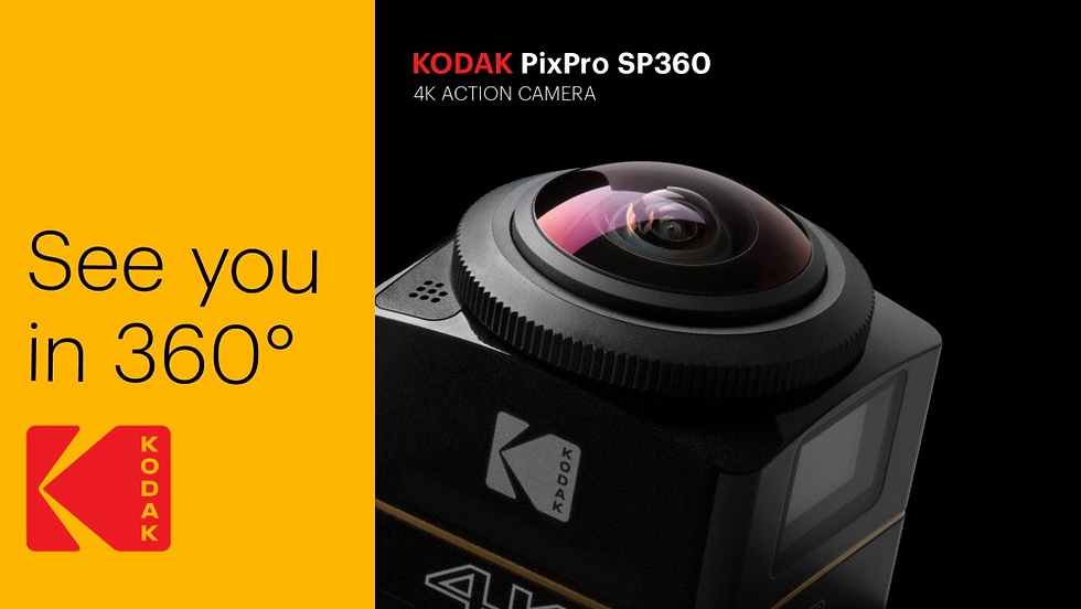
Kodak

Kodak — you know, the company you used to buy film from. (I kid; I still buy Kodak film from time to time to take pictures with my Pentax Spotmatic.) The Kodak company has been through a lot of trouble over the years as digital cameras have all but eliminated the need for physical film. But Kodak has pushed through it. In a recent rebrand, they went back to their roots. In 2006 the company had already eliminated the big red “K” block in favor of a simpler wordmark, but then they reversed the decision. Using a fresh sans-serif font, they stacked the letters on the right side of the red block. The visual branding on the packaging is bold and simple, helping their products stand out.
Key takeaways
When working with a brand that has as much history and legacy as Kodak, you can’t just throw it all away. The branding effort effectively evolved the logo to keep it fresh without losing its heritage.
Deliveroo

British food delivery company Deliveroo recently underwent rebranding with DesignStudio, turning away from a literal depiction of a kangaroo to an abstract version that also happens to look like a hand giving the peace symbol. They opted for large, angular swashes of bold colors to fill their palette, giving the brand energy and a fun personality. The design is also decidedly flat, falling in line with contemporary design trends. The vibrant design motifs work well with their delivery uniforms, making their riders unmistakably visible.


Key takeaways
I love how Deliveroo successfully uses a large palette of colors. They are all exciting and work well together, but the branding is not lost by using different colors. While it can be difficult, using more than just a few colors in a brand can pay off in big ways. I also appreciate that they were able to make uniforms that were better-looking and more functional than the previous design. Improved form and function is always a design win.
Pandora

So, this might be a controversial brand to include in this list, considering that Paypal sued the company at the beginning of 2017 for trademark infringement. Nevertheless, we’ll break down what makes the Pandora brand system work so well. Pandora’s main logo is a modified, all-lowercase sans-serif wordmark. The alternate icon logo is a “P” with the bowl removed. It’s interesting that, instead of reducing the wordmark to just the lowercase “p,” they designed a different uppercase “P.”
Much like Spotify, Pandora needs to represent a large spectrum of musical styles and cultures. They went even further than Spotify in this regard by modifying their logo to visually embrace a wide array of design and photography styles. In my humble opinion, this shows that Pandora is more invested in music than their competitors.

Key takeaways
I really appreciate that Pandora went all in to pay tribute to different styles. That shows commitment to your user community. With something like music, which is so closely tied to individual identities and collective cultures, it is essential that brands show sensitivity to such things.
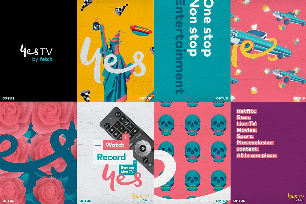
Optus “Yes”
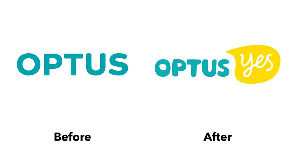
This is one of my favourite rebrands in the last few years, also out of Australia like the Melbourne rebrand above. Sydney-based agency Re took the Optus cable brand and turned it into something awesome. By capitalizing on Optus’ “Yes” mantra, Re made exciting new visuals that help the brand stand out. Compare that to the sad state of branding for U.S.-based cable companies like Comcast, Cox and Time Warner.
The branding is effective and beautiful standing alone (as seen in one of their clever patterns), as a vehicle to display their various entertainment options, or included with models who I suppose are there to represent their customers.

Key takeaways
While other cable companies are zigging towards being boring “high-tech” monsters, Optus zagged in the direction of fun, kind and personal. It’s tempting to try and beat your competitors at their game, to outdo whatever design look they are going after. Often it is better to forge a new path and help yourself stand out.
99u

Okay, including 99u might be cheating slightly here, but hear me out. See, 99u is Adobe’s creativity thought leadership arm. They run a fantastic blog, publish books and host a yearly conference. So one, they are already a creative powerhouse, and two, because the visual branding is tied so closely to the conference, it changes every year. But in case you’re still not convinced, let’s dive into it and see how genius it is.
A key part of what 99u does is the yearly conference. And each year, the branding is fresh and unique. At the same time, the branding always ties in with the books and website. That is the advantage of having a visual branding system that is based on design elements and principles. The specifics of the design can change, but everything still looks cohesive.

Key takeaways
For brands that need to be applied across a variety of applications or updated frequently, it’s important to set up a framework that supports creativity and fresh designs while still keeping your brand identifiable.
Now since you made it this far, how about a bonus one?

Zendesk

Zendesk is help desk software that helps companies everywhere provide quick solutions to their customers. The original logo was a happy Buddha (hence the zen) wearing a headset.
On the surface, Zendesk could be a boring product. They just offer help desk services. The old Buddha logo was unique and interesting at the time, but it was aging poorly. By reducing the logo down to simple shapes, it makes the the logo instantly recognizable. They also capitalized on this look by expanding the simple shapes across all of their services. Finally, the shapes were brought to life thanks to fun motion graphics.


Key takeaways
Don’t be afraid of simple shapes. Noted designer Aaron Draplin has spoken extensively about the importance of designing simply, eliminating the extra stuff, cutting out the fluffy details and getting down to the essential shapes. While there is a place for detail, simplifying designs almost always strengthens them.
Written by Scott Talbot (Source: Lucidpress)


Comments